
Introduction
Graphic Design (as a discipline) has evolved in the last 2 decades more than anything else. There was a time when designers were considered only executors. Old-time designers, remember your CoralDraw days? How much do you think have we evolved just in a matter of few years? Today, designers flaunt a swanky new prefix (the likes of IxD, UI, Motion Design), use cutting-edge tools (think Sketch, Figma, Invision) and have the best online resources (think Dribbble, Muzli) to guide them in their day to day work.
Another big upgrade is that today’s designers have a seat on the table. Why, one may think. The reason is that today we are increasingly using more and more digital products and moving towards a completely digital ecosystem. UI Designers are the enablers of those magical, almost life-like interfaces we interact with everyday. While designers enjoy a better authority, they also have a bigger responsibility on their shoulders. To create seamless experiences and enable emotional connections between humans and technology.
Good design is making something intelligible and memorable. Great design is making something memorable and meaningful.
– Dieter Rams
While we would like to know and learn new tricks and trends as we grow in our practice, its equally important to stay true to the basic and timeless concepts that drive the essence of UI Design.
Today I would like to take you through some basic but key principles that ensure you achieve something memorable and meaningful everytime you design digital products.
1. Hierarchy
Hierarchy, much like its traditional meaning, is the arrangement of items in order of their importance or weight on the screen. Visual hierarchy explains how we can organize content and design elements effectively. It’s natural that elements having more visual weight tend to catch users’ attention. This behavior should be considered when designing a layout.
- Establish visual relationships among layout elements
- Then add different visual weights to each of the elements
- Finally create patterns of eye movement
E.g., the title of a blog would require more attention than body text. Similarly, in interface design a call to action (aka CTA) might need special importance than others. Whenever we attempt to make sense of information visually, we first observe similarities and differences in what we are seeing. These relationships allow us to distinguish objects.
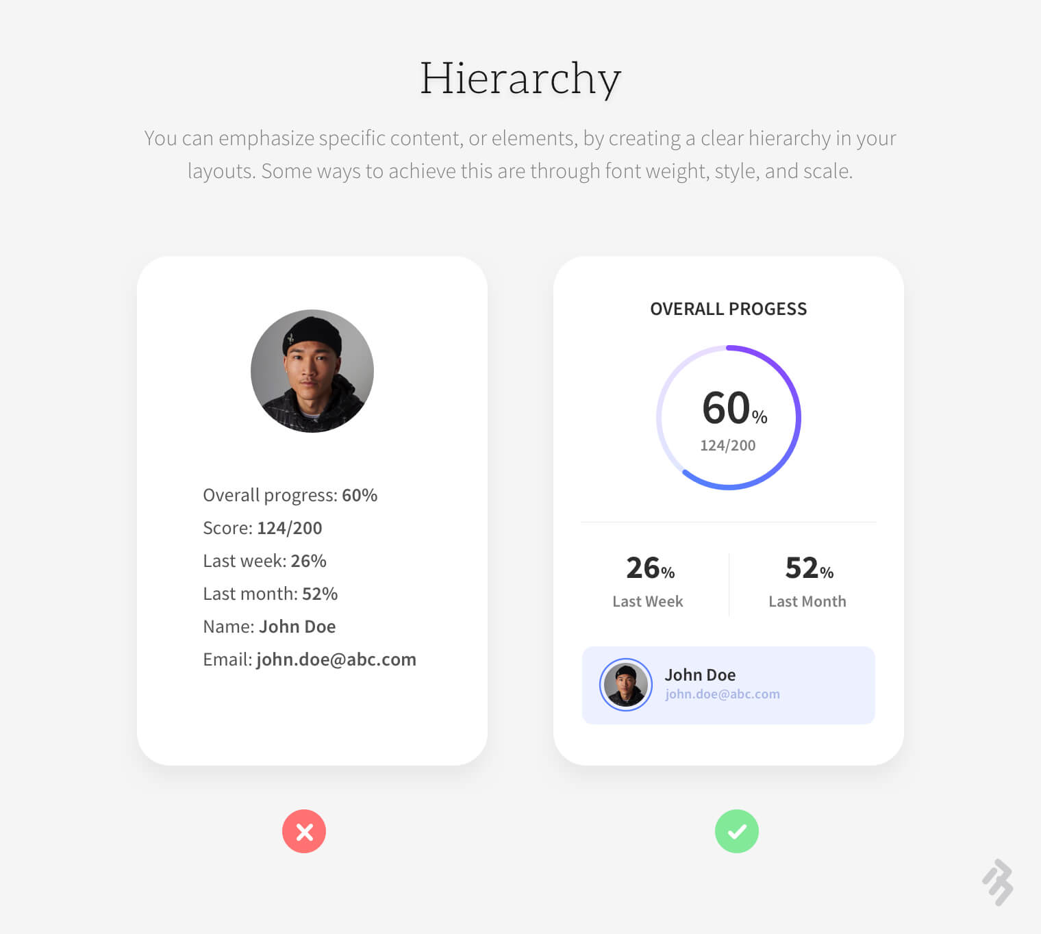
Let’s discuss 4 basic elements that are key in building visual hierarchy.
- Size
Size is an important tool, particularly in the case of text. It is human tendency to identify bigger text as more important. Also bigger elements are more noticeable that’s why our eyes automatically catch the bigger text, images or illustrations. So designers should understand the priority of each element on the screen and size them accordingly.
- Color
Colors play an effective role in hierarchy creation. Even the most basic colors black or white have huge impact on users’ browsing pattern. Users emotionally connect with colors and so different combinations can be smartly used to guide users to take intended actions across your digital product. There are different color tones available, e.g., soft, bold, bright. Designers should do a detailed study of the color-wheel to master the choice of colors.
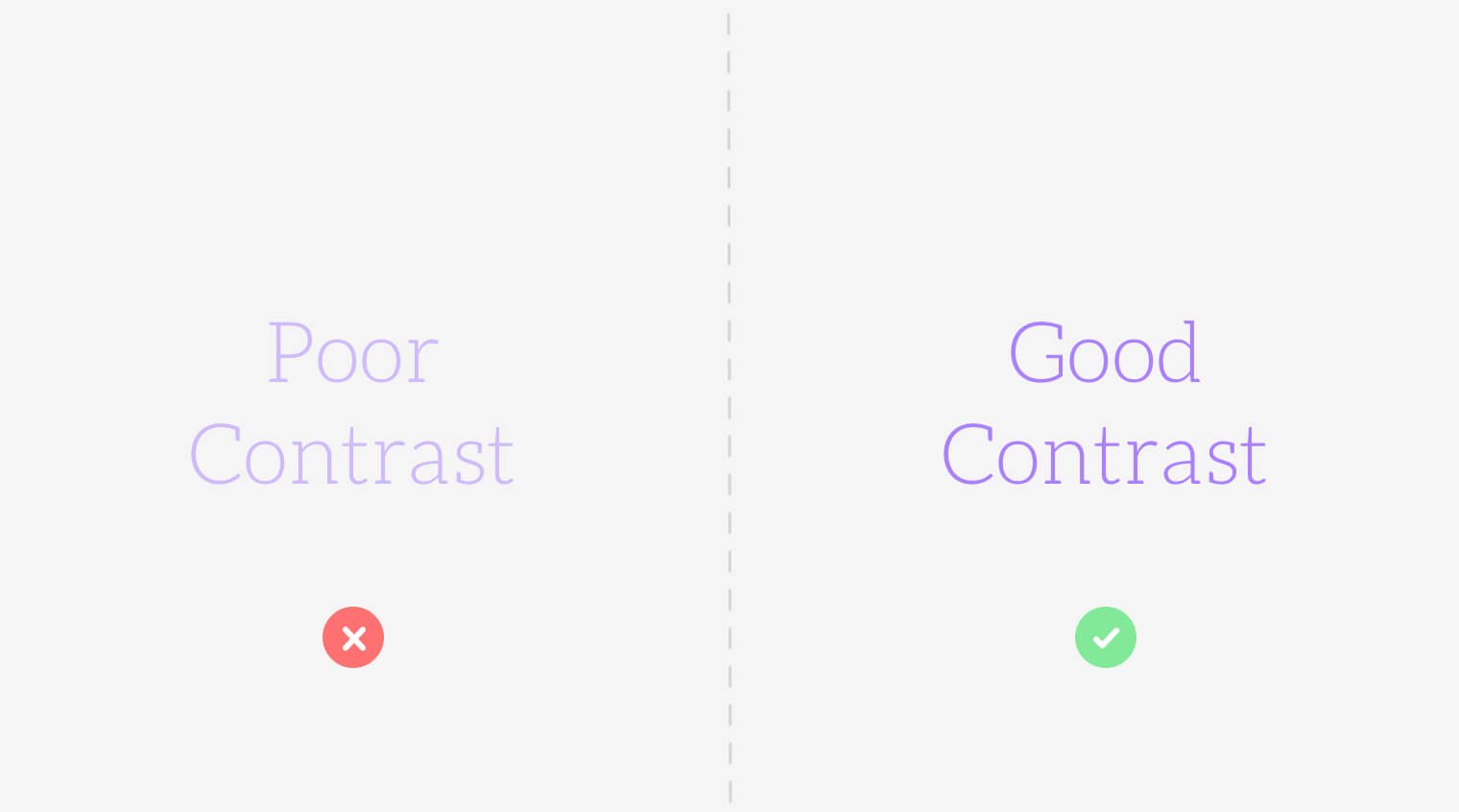
- Contrast
Contrast is hierarchy. We create contrast using colors, type weight, type size etc. We will discuss this concept in detail in the next section.
- White Space
Some experts say that white space is a visual design element rather than just a canvas. If used appropriately it can help a lot in creating great interfaces. It's basically the area between multiple design elements and helps users understand the relationships between elements so right amount of negative space is necessary to convey correct information.
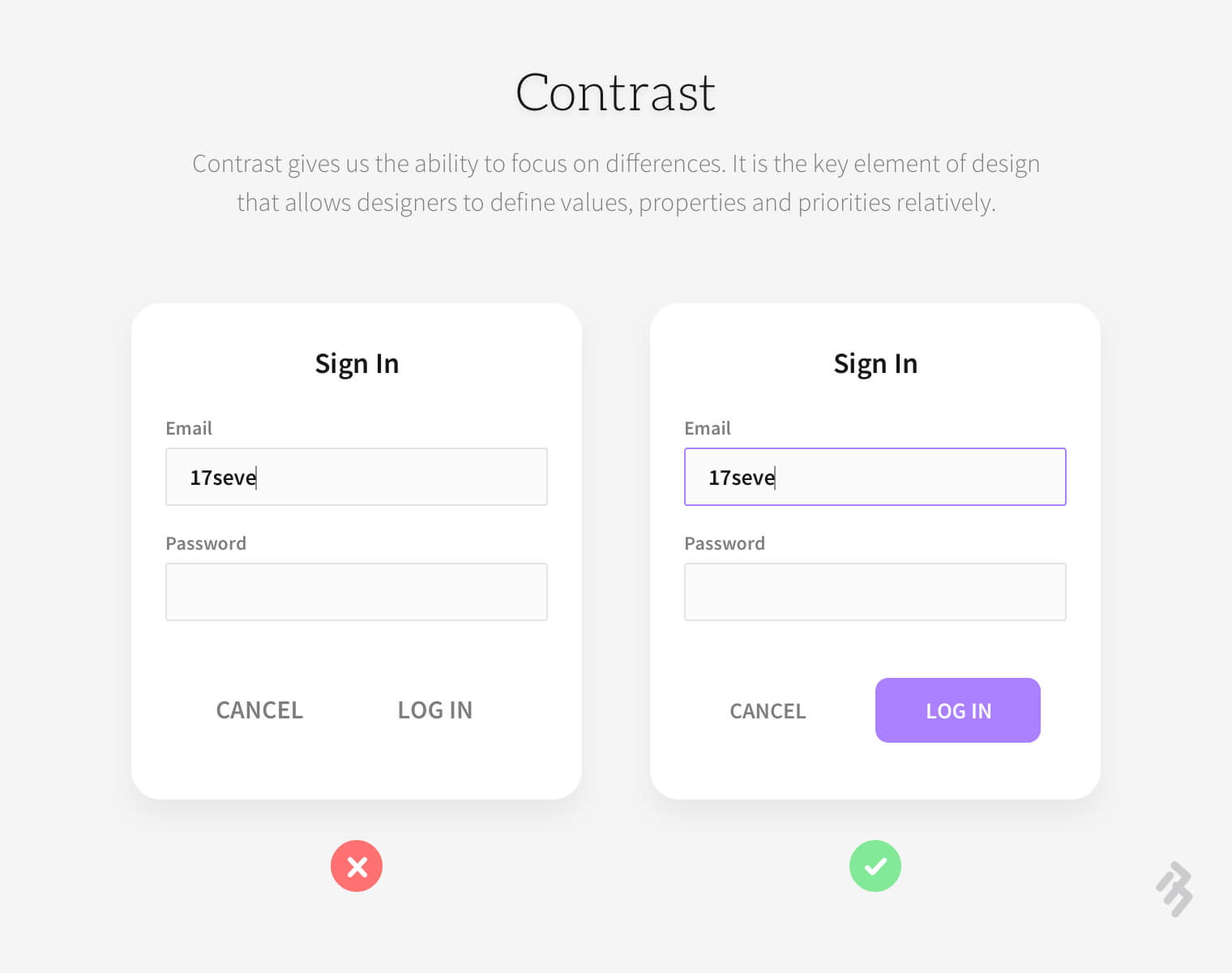
2. Contrast
Contrast is another important principle which helps us design better interfaces. It’s not only about light and dark color opposites or small and big sizes: it's more than that. Contrast help us organise our content in a better way, also it helps users to focus on certain elements. Apart from emphasising on elements it also creates a visual balance and interest in design. However too much contrast can be confusing for users. It could create many focal points because of which users may find it difficult to take intended actions. Aim at creating just the right amount of contrast by playing with:
- Size
- Color
- Weight
- Styles
- Fonts among serif and sans serif
- Fill
- The possibilities are endless
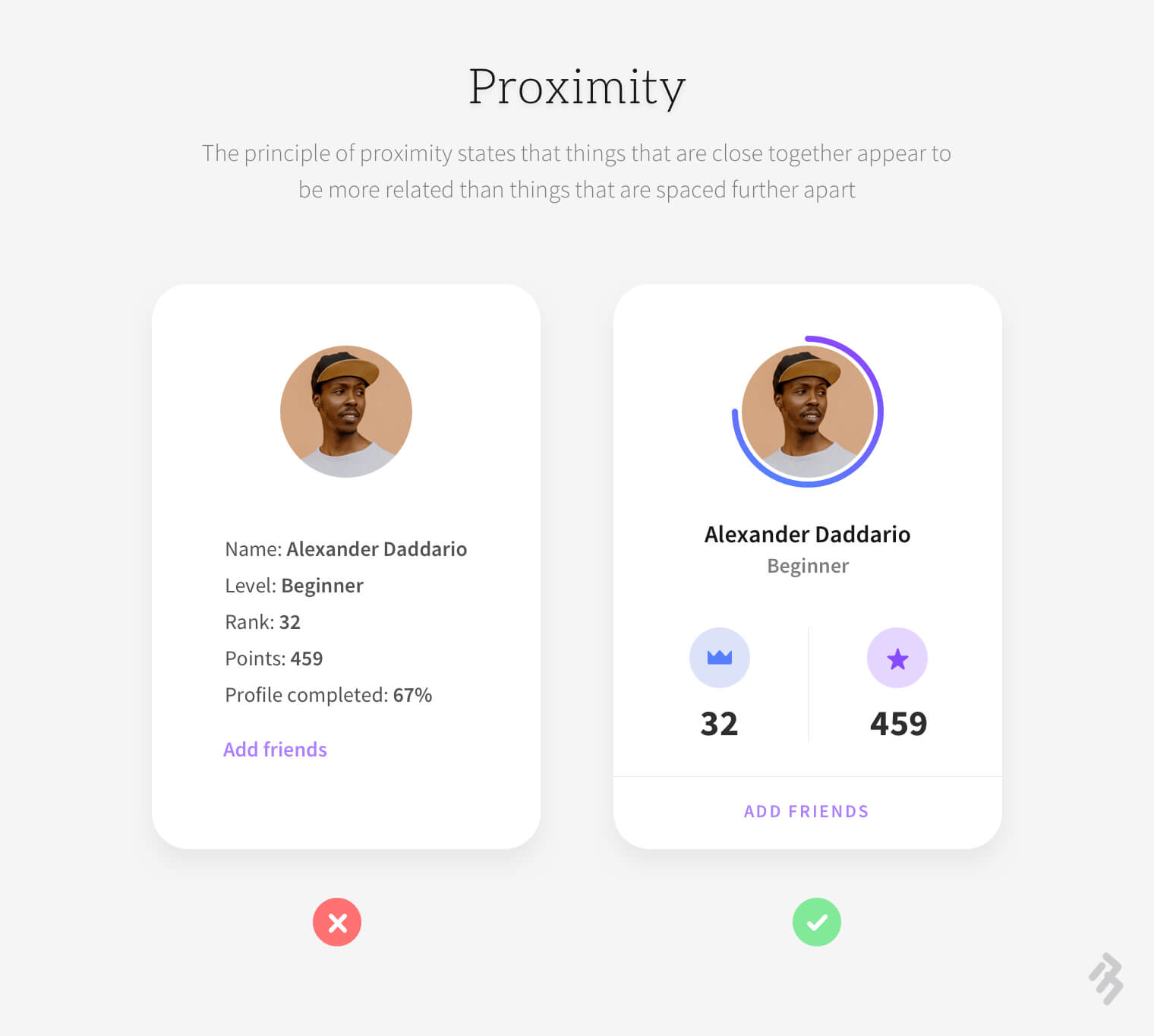
3. Proximity
This principle describes that visual elements are perceived to be related if there are visually similar. This way, visually similar elements are viewed mainly as a group and not individual elements. So we can use the principle of proximity in UI design for grouping similar information which is related to each other. e.g., we write subtext below a title to support it. The principle of proximity helps designers make the interface easy to scan and grasp by users. It is a proven fact that proximity overpowers other tools like colors, shapes or styles.
One of the areas where proximity plays an important role in interface design is Typography. Users do not like to read long chunks of texts. It’s hard for them to identify important pieces of information. Hence designers should break-down big body copy chunks into smaller pieces so that users can easily grasp and digest the information. To the contrary, items that belong to different groups must be placed far enough away to prevent any negative influence. e.g.
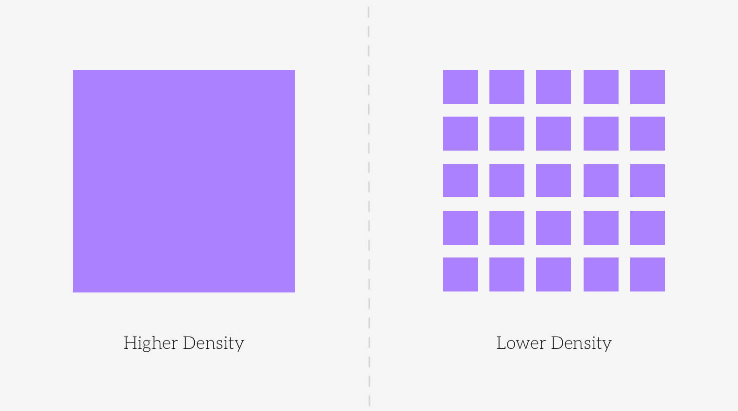
4. Balance
A balanced composition feels stable and pleasing to the eye while an unbalanced design can create instability and distraction. Visual balance is about having both negative and positive elements in equal proportions in the design. A balanced composition may have some areas which draw users’ attention but it should not clash with the visibility of other elements. Remember that visual balance should imitate physical balance of real-life products to keep users engaged with the design. Designers can balance a composition by playing with the visual weight of elements. Visual weight can be decided by how much an element stands out. There are multiple parameters that affect the visual weight of an element e.g., size, color, contrast and density.
- Size
Human brain tends to interpret bigger things to have more weight. The same psychology applies in digital interfaces as well.
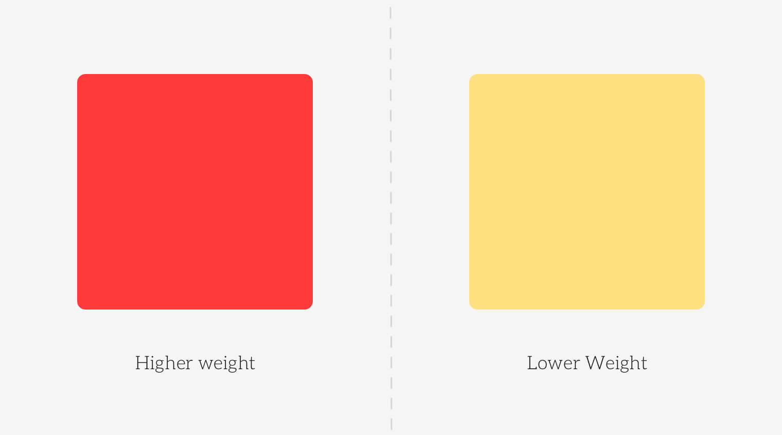
- Color
In case of colors it works differently, i.e., sharp and bold colors have more weight regardless of the size. An element will stand out even though it may be small in size but its color is sharp or bold e.g., red, dark blue etc.
- Contrast
The difference between light and dark elements is called contrast. In interface design if we want to draw users' attention or want to highlight something we use contrast. But naturally the darker element will have more weight.
- Density
This one is obvious that things which have more density regardless of color, and size will be having more weight.
User Interface Design is about communicating with users, providing them convenience and solving their problems rather than just focusing on designing beautiful-looking graphics. The principles we have discussed today will help you achieve a better overall user experience and with practice you will find yourself mastering these concepts.
We hope that you find this blog useful. Feel free to share it with your friends and colleagues so that more designers can benefit from it.
You might also like this article on how to design high conversion forms.
