
We already know that User Experience is all about Human Psychology. For those who like to back up opinions with data, pay attention to the definition of Human-Computer Interaction or HCI:
“it’s a multi-disciplinary field situated at the intersection of computer science, behavioral sciences, design, media studies, and several other fields of study.”
So back to the point- since we know that psychology is an important component of HCI and ultimately makes or breaks how effective your product’s UX is, we can build a smart tool-kit that can be used to pre-empt solutions based on how our users’ minds work i.e., users’ psychology.
Does it replace UX Research? Hell, no! Infact what it does is to give you an insight on how the majority of online users behave/react in similar ways, when presented with similar scenarios.

If you are one of those who never thought about it and now would like to, but don’t know where to start, fret not! We were just as curious as you are right now, and we got so obsessed that we spent days going over many many pages of online resources just to compile this list of handy tips for you. (ahh… you’re welcome!)
In this blog, we have aimed to avoiding jargon as much as possible, since we would like us to remain UX designers and not want to get a PhD degree in psychology just to be able to make sense of this blog! (lol) We have also built simple action-oriented tips that all you UX designers can plug-and-play in your existing projects and even better, plan your future projects from scratch by laying these tips as building-blocks.
If you would like to know more about how these tips can be implemented on your product, or simply get more in-depth information on each of them, we are just an email away.
So let’s begin, shall we?!
Tip 1: Don’t be over-creative or over-original
Yes, you read it right! Your users are well versed and interact with a wide range of digital products and hence they want your product’s experience to be similar to the ones they are already familiar with.
This is based on Jakob’s law, coined by the famous Jakob Nielson and recommends that while creating new products, we should refer to similar products so that our first-time users get a sense of association. Going by this law, being over-original may not always be the best policy since it could drop the adoption rate of your product. This doesn’t mean your product has to look and feel like every other product online. It’s a fine line to design along, but good designers can do great work while still adhering to a common language.
Ever wondered why most ecommerce websites look alike? Jakob’s Law is the answer.

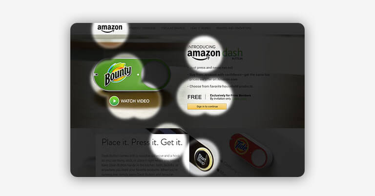
Tip 2: Visual guidance leads to desired action
If you want to focus your users’ attention towards a particular object on your design, whether to take an action or to simply ensure they remember it, that object should be distinctive either visually, contextually or via experience.

This is based on the Von Restorff Effect aka the Isolation Effect and states that when multiple similar objects are present, the one that differs from the rest is most likely to be remembered.
Emphasize important details by altering color, image, light, size, font, animation, sounds and words. However proceed with caution, as too many objects calling for attention could spell disaster for your design and turn counter-productive instead.
Below is a good example of Isolation effect.

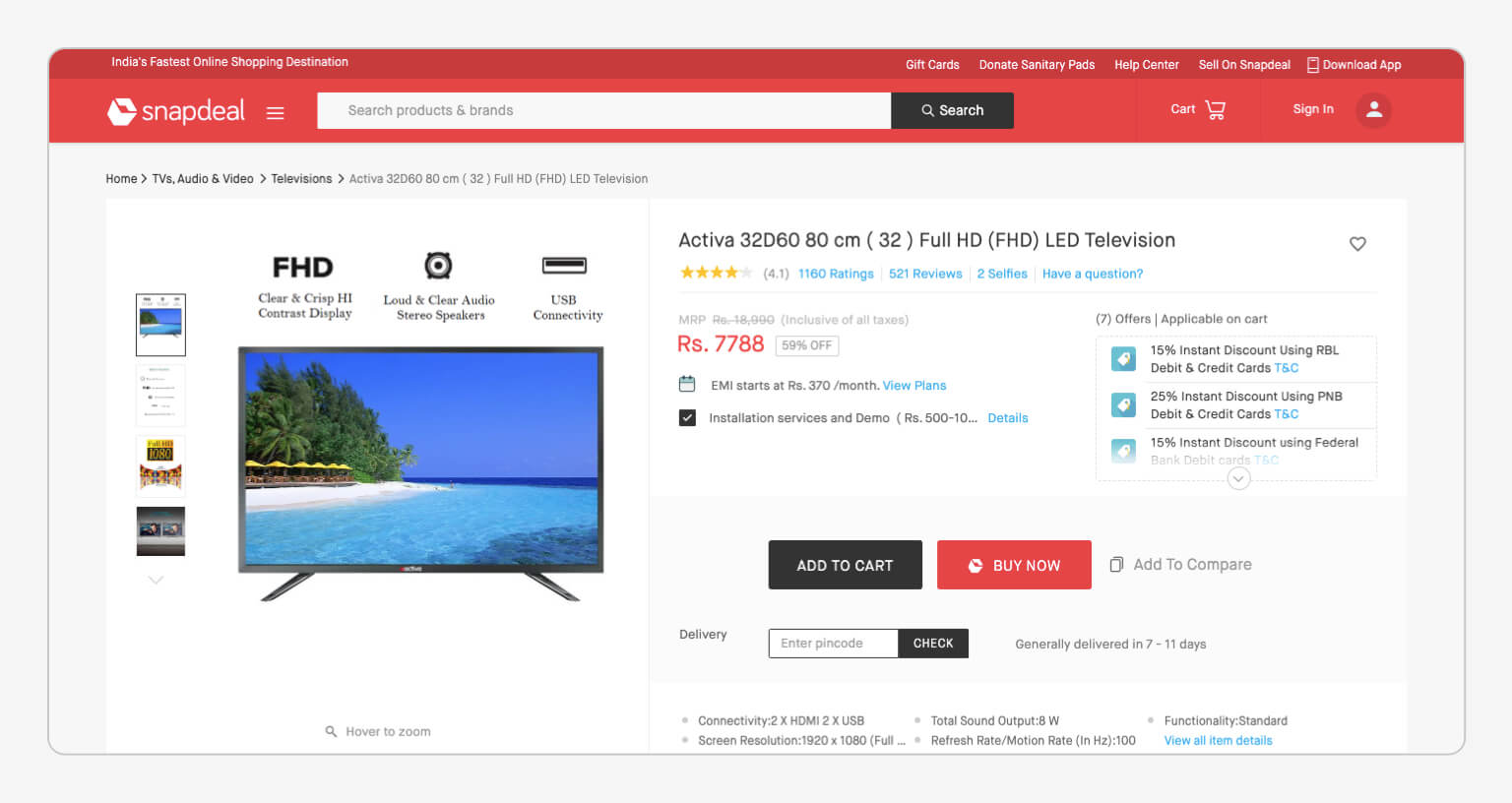
Tip 3: Too many choices could spell disaster
Don’t offer too many choices to your users upfront, since it delays the time they take to act on either of them. Instead break-down the choices into simple and actionable capsules spread out evenly since it reduces the cognitive load and allows users to take more positive actions faster.

This is based on Hick’s Law which suggests that users subconsciously weigh the costs and benefits of a decision before taking it. This is known as the cost-benefit analysis. So to simply put: the higher the number of choices, the longer it takes to analyse them.
In cases you can’t do away with choices, a good way is to highlight recommendations.
Hicks Law is especially useful while designing forms, drop-down menus and more broadly the overall information architecture of your product. Think Hick’s Law when response times are critical.

To be a great designer, you need to look a little deeper into how people think and act.
– Paul Boag, Co-Founder, Headscape Limited
Tip 4: Accomodate to users’ working memory
When showing users groups of information, limit the number of the main categories to a max of 5 at a time, not more.
This technique is known as Chunking, which is an effective method of presenting groups of content in a manageable way. Chunking can be applied to top navigations, drop-down menus and any other place that displays groups of multiple information.

This is based on Miller’s Law, which states that an average human being can keep only a max of 7 items in their working memory.
Ever wondered why OTT media websites like Prime Video have such a simple navigation menu, in spite of housing thousands of content categories?

Tip 5: CTA Buttons should always be prominent and in vicinity
When designing a CTA (call-to-action) button, keep in mind 2 things:
- Make it easy to locate
- Position it close to the user's cursor (aka prime pixel)
Many studies have suggested that larger buttons are easier to spot and more user-friendly especially on mobile devices. On the contrary, smaller buttons are difficult to interact with. The reason being: bigger buttons cover a large space so the probability of “hitting” click on the button is high.
This is based on Fitts’ Law which states that the time taken to move to a target area is a function of the size of the target and distance to the target.
However one word of caution- the idea is not to make the buttons as large as possible, the underlying principle is usability. Use judgement when designing buttons for size can sometimes be counterproductive too.

Now let's talk about "prime pixel" for a bit. What is it? Prime pixel is the point from which users carry out most of their actions while on your page. Try this: right-click on your mouse right now. See a menu pop-up? This point is your prime pixel at this moment.
While determining prime pixel of a user at a particular time is difficult, testing your designs with users can help you see probable patterns. You can then create the shortest path to the actions you expect the user to take.
For example, if a user is reading up on a page, and the copy prompts him to click on something, the button to do so should be as close to the text as possible.

Below is a good example of Fitts' Law.

Tip 6: Users navigate pages ignorantly and drop off fast, so design for their attention
When users visit an online interface with a particular purpose in mind, they don’t bother to read everything that’s written on the screen. Instead they roughly scan the page seeking the information. Moreover, if they don’t find it within as short as 8 seconds they drop out.
This is based on the principle known as Selective Disregard that explains how online users have developed a way to naturally ignore what they consider ‘irrelevant’ on the screen. This phenomenon also occurs in our daily lives because it's impossible to give attention to every stimulus around us. Hence we use selective attention to decide what stimuli are important as events occur.
Furthermore, with the increase in mobile phone usage, user attention spans have further dropped from 12 secs to a cursory 8 secs.
Conduct usability testing of your product to find out which pieces of information do users find important and which ones tend to feel like ‘irrelevant’. By understanding the scanning patterns, place the important information in the peripheral vision of the users and re-test to confirm.
Here are some examples illustrating research findings to see where users pay attention while navigating on e-commerce websites.

There's a lot more where this came from! But hey, we don’t want to overwhelm you with tons of new stuff in just one post. Hence we have broken this blog down into 2 parts. We hope that after reading today’s blog you will practice some of these tips at your workplace (and show-off your newly acquired psychology knowledge to your peers). Meanwhile we would be writing part 2 of this blog that would serve you with many more such simple yet revealing tips about user psychology.
See you in the next post!
