
Introduction
Forms are an inseparable part of our lives & play a crucial role especially in the digital world. How many forms are filled out each day across the web? Billions of them, for sure. It’s hard to imagine a digital product without at least one form. The different ways a user interacts with forms are during registration, subscription to newsletter, contact form, customer feedback, online transactions, booking tickets, online shopping and also while inputting data or sharing information etc.
However, the funny thing is that most people hate filling forms, no matter how inevitable they are! Ever wondered why? To me personally, forms feel bizarre, boring & non-human. I have spoken to many users over the years and most of them share the same sentiment as me. They complain of bad user experience on most forms, resulting in dropping out mid-way.
Why are forms even needed?
From a business point of view, brands work hard on lead generation campaigns everyday to convert users into potential customers. Companies often suffer from lower conversion rates that’s when importance of user contact forms comes into the picture.
If you truly want to boost your conversion rates then you should focus on the right approach - Design forms for higher conversions!
How to design forms that convert?
A simple thumb-rule while designing forms is - SIMPLICITY! In today’s post, we’d like to go over some practical tips and recommendations backed by research and experiments that will improve your conversions.
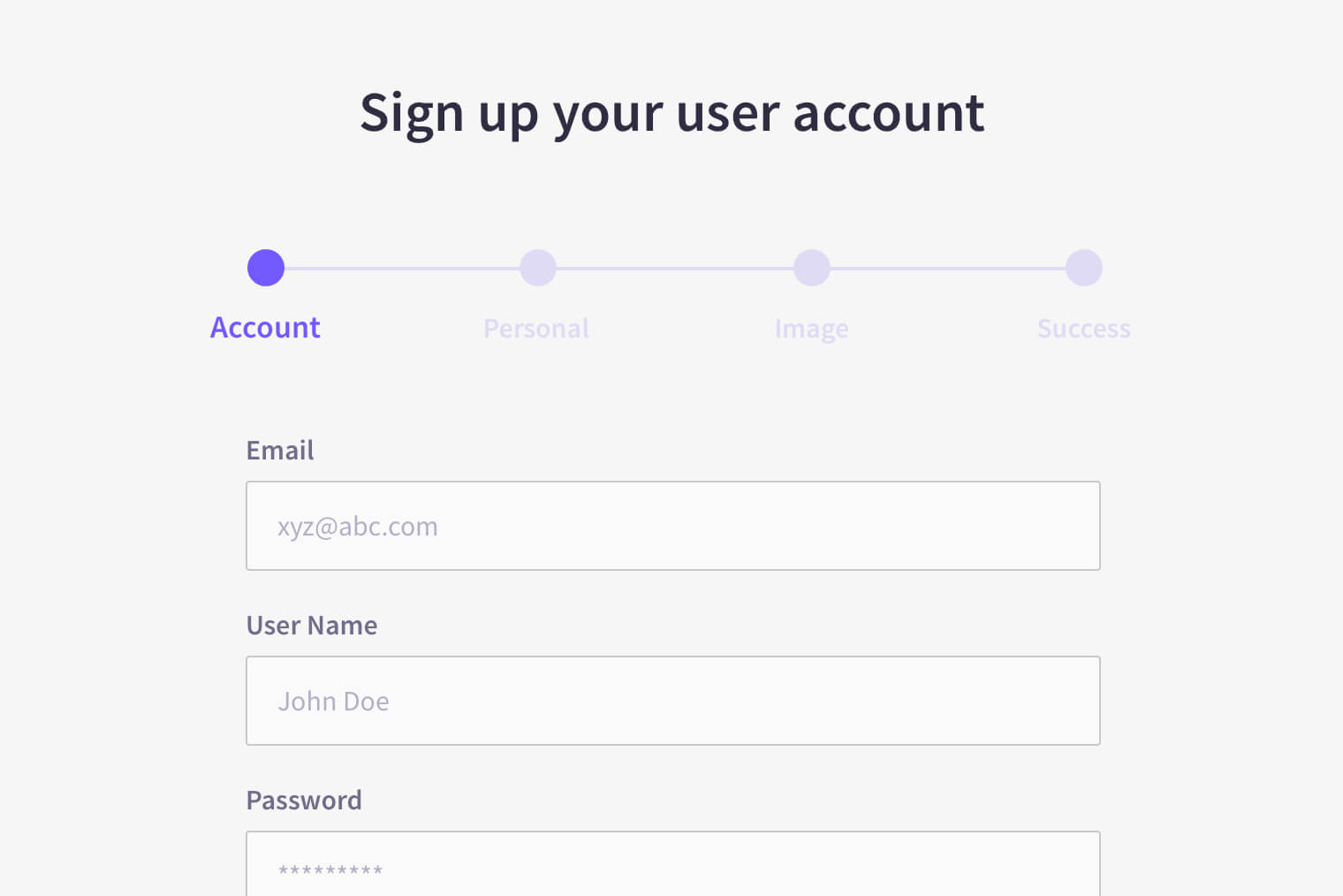
1. Break the input fields into steps & order logically
Breaking your forms into multi-steps almost always simplifies the process for users and increases the chances of completion. Too many input fields on a single page can increase the cognitive load of the users and they are more likely to leave the form. Users are more motivated when they feel they are reaching towards a certain goal, e.g., progress bar, collecting rewards etc according to endowed progress effect.
Also, when we arrange our input fields logically, for instance, from easiest to hardest and ask for more sensitive information (phone number, email) in last steps, there are higher chances of users completing the forms as they have already invested their time in it, according to sunk cost fallacy.
2. Fetch only what’s important
Asking for unnecessary information can frustrate your visitors and you might lose a potential client. Hence try to reduce the number of input fields as much as possible.
It’s proven that more number of input fields in a form minimize the conversion rate. Don’t ask it until it's absolutely necessary. Think how many times have you filled your PIN code only to fill your city next. It’s only logical for a user to expect the system to be self-learning and fill up everything that’s logically connected on its own.
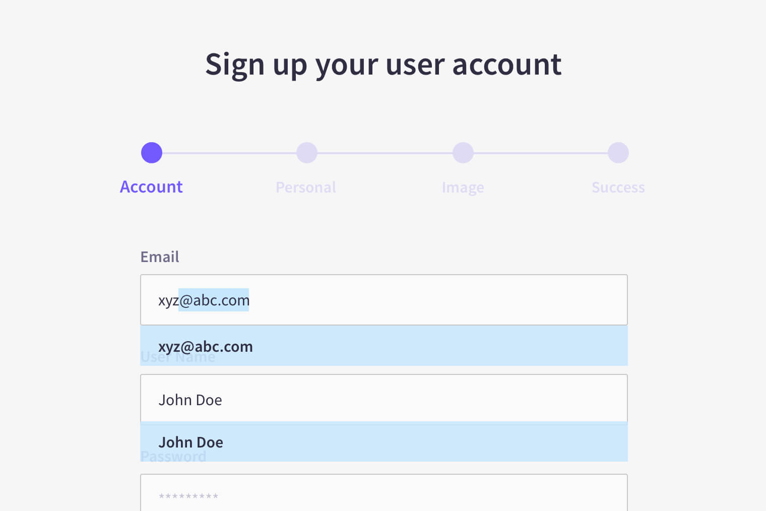
3. Autofill the data
The previous point brings us to this tip. Most web browsers now-a-days have this great feature where they capture user data entered in forms and auto-fill when needed. By integrating this feature during development phase, you can save a lot of your visitors’ time. It’s particularly helpful in case of login and payment forms.
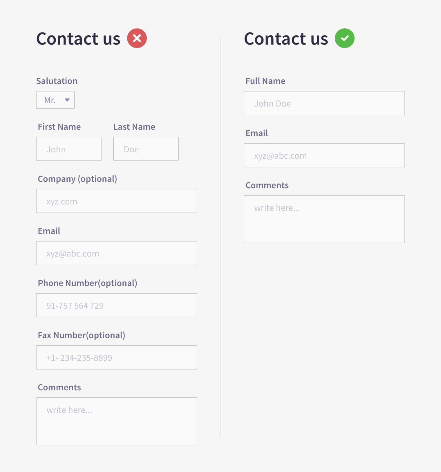
4. Single column input fields & their size
Avoid placing input fields side by side horizontally. An eye-tracking study shows that its hard for users to scan information when placed in that fashion; in extreme cases they might abandon the form completely. A study by CXL Institute found that participants were able to complete a single-column form an average of 15.4 seconds faster than a multi-column form. Single-column layouts are easier to understand and more importantly readable.
To achieve higher usability rates, the size of input fields should always be proportional to the size of input data. For example, we should use smaller fields for inputs like PIN code or CVV. If we create too big or too small input fields, users find it challenging to understand what is to be entered there. So, in order to avoid any kind of confusion we should match the field sizes to the input data.
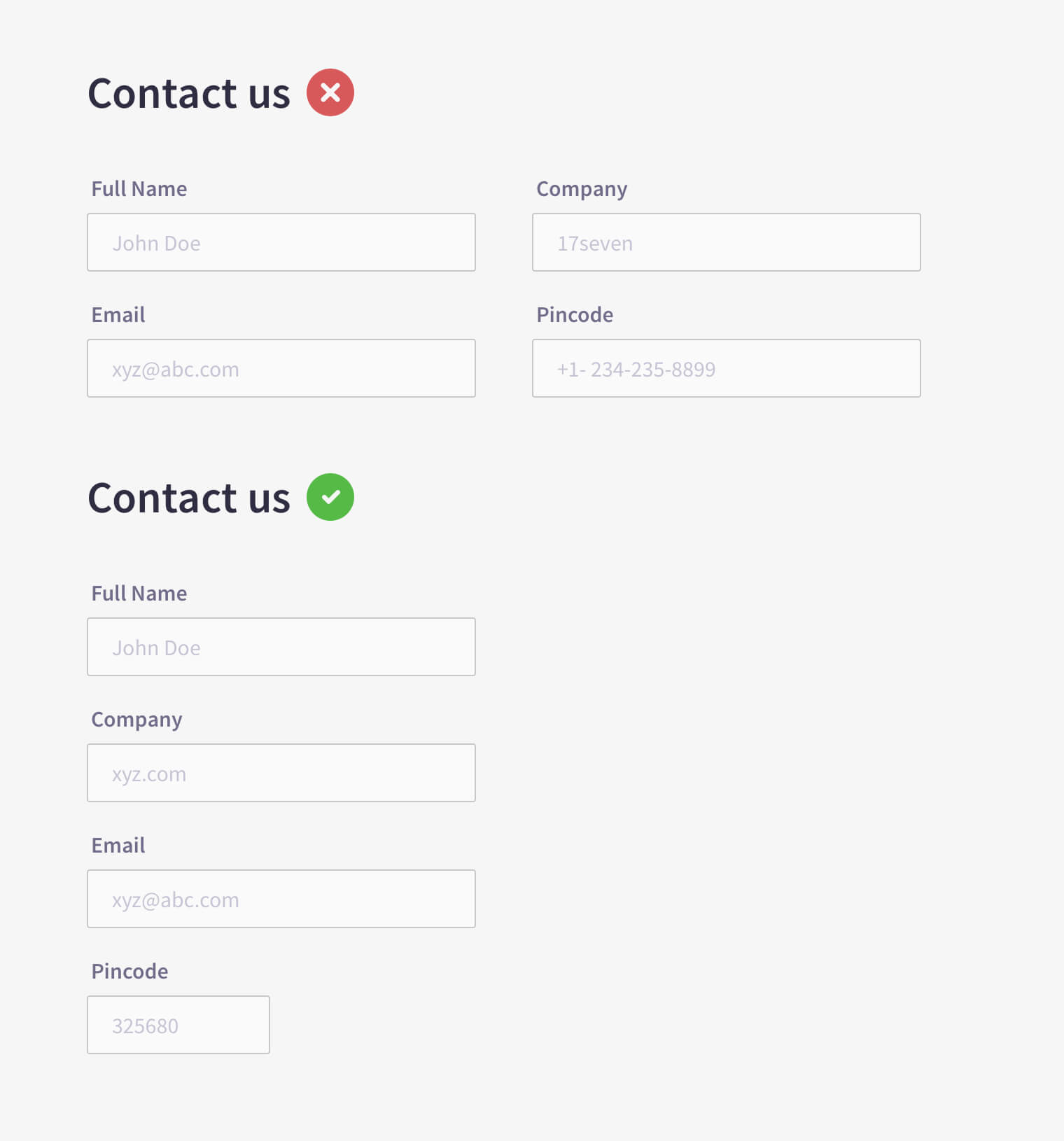
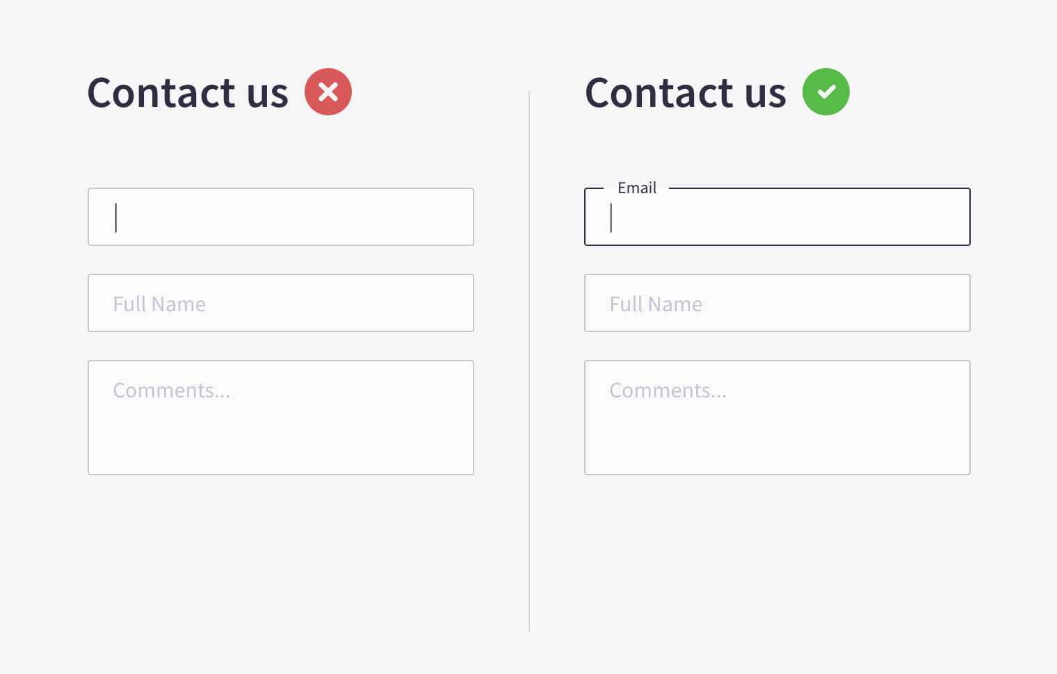
5. Clear input field labeling & placeholders
We should always left-align input field labels and place them on top of the field because users scan things from left to right on the screen. The input field label should never be written inside text placeholders; they are best used for providing hint copy.
At times designers do that in order to make the forms appear cleaner. However, in such a case, when the user starts typing inside the field, the placeholder disappears and it increases the cognitive load of the user to recall what he/she was trying to fill. Although a new style of floating placeholders is trending now-a-days, being implemented by Gmail and other large organizations.
6. Intuitive error messages
As humans, users make errors at times. We can’t expect them to be perfect. As designers we should design in a way that we minimize the possibility of errors. Whenever an error is made, the user should receive clear error messages. Many times users drop out simply because they don’t know why the error occurred, neither there was a clear notification about the causes.
As a best practice, we should educate users about the error as well as provide possible prevention and hints to correct it. The error field should be highlighted to draw the user's attention to the problem.
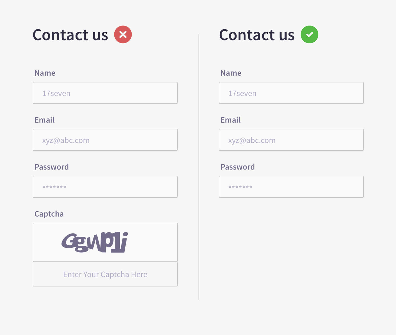
7. Avoid Captcha
You may have seen some random numbers & shapes at the end of some forms that you can hardly read, those are called captcha codes. Captcha was introduced to prevent any kind of spamming and to secure user’s data, but it's annoying and time-consuming for users. It also affects conversion rates; and in recent times many studies & surveys have shown that removing captchas from forms increased their conversion rates a lot.
8. Optional fields and clear call to action
Many times brands guardians find themselves flooding the form with too many fields, many labelled as Optional. Ask yourself- If it’s important, it better be mandatory. Optional fields are best avoided. Too many fields in your forms might frustrate your users. They should be able to differentiate between optional and mandatory fields. Use visual elements to provide the distinction. And no, don’t just put an asterisk (*).
At the same time, your CTA should stand out and draw users’ attention. You should always add a personal touch to your CTA labels. e.g., instead of writing ‘send’, ‘submit’ etc try ‘login’, ‘let me join’ etc. Use contrasting colors for your CTA so that it can easily grab users’ attention.
Final thoughts
Sometimes forms feel bizarre & mechanical, hence users don't hang on till the end that leads to lower conversion rates. A badly-designed form can often be reason enough for businesses to lose their potential customers. A simple thumb-rule is to keep form design as simple as possible.
- Break the input fields into steps & order logically
- Ask only important information
- Single column input fields & their size
- Clear input field labeling & placeholders
- Autofill the data
- Intuitive error messages and avoid captcha
- Optional fields and clear call to action
17Seven is an award winning design agency with more than 10 years of experience in the industry.
The team designed brand visual identity for Axis Bank, Vinesia, Al Dahra, Sky2c and lot of other famous brands. In addition to brand identity design, 17Seven provides UI/UX, develop websites and apps.


